These Charts Are Screaming 'Recession'
- The U.S. economy is staring a recession in the face.
- From falling corporate profits, to plunging commodities, to a contracting manufacturing sector, to rising bond spreads and much more, there is no doubt a slowdown has begun.
- Despite the slowdown, there are and will continue to be investing opportunities across various asset classes.
Prior to 1937, there were two primary ways the public referred to economic slowdowns: (1) as a "depression," and (2) as the "Panic of [enter year]." Most everyone has heard about the Great Depression. But have you heard about the Depression of 1920/21 or the Panic of 1907? It was only after the worst of the Great Depression, a period of economic calamity so severe that it profoundly affected the psyche of the American public in long-lasting ways, that the word "depression" was replaced with "recession."
The use of specific words can have a profound effect on people's psyche and outlook on life. This is no secret to those who seek to influence the citizenry at large, including those within the financial industry who seek to promote certain narratives at the expense of others. Given the devastating effect the Great Depression had on the American psyche, it is no wonder that beginning with the "recession within the depression", people began to refer to downturns in a different way. The recession of 1937/38 kicked off a new era of describing economic downturns, an era that lasted right up to the Great Recession of 2008/09.
Nowadays, with (1) the U.S. still stuck in a hangover from the Great Recession, unable to break out economically, the way the country has in prior recovery periods, and (2) politicians, economists, and investing pundits seemingly unable to even utter the word "recession", lest the public conjure up memories of the horrors of late 2008 and early 2009, it's clear the mainstream media is in desperate need of a word to describe today's early "recession-like" environment.
Today's environment walks like a recession, and it talks like a recession. I won't call it a recession, lest I offend the multitudes trying desperately to erase from memory the events of the Great Recession. But make no doubt about it. The charts that follow, as a collective group, paint a picture that is screaming "recession".
The Recession-Like Economic Picture
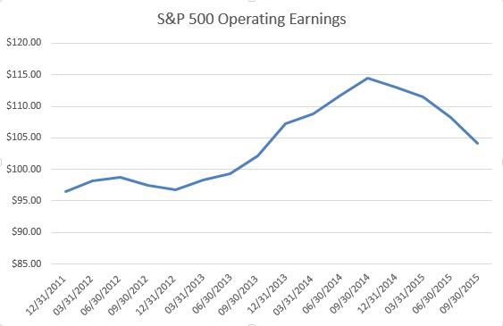
There are so many places I could begin to show the deterioration in the U.S. economy. I'd like to start with the mother's milk of stocks: corporate profits. You certainly wouldn't know this is you just followed the price of the S&P 500 (NYSEARCA:SPY), or if you listened to the constant mainstream-media drivel about earnings growth, but over the past four years, S&P 500 operating earnings have grown at a compounded annual rate of just 1.95%. In fact, as the chart below shows, earnings peaked in Q3 2014 at $114.51 and have since fallen 9.01% to $104.19. With earnings down double digits, one might expect the major market averages to have gotten crushed. And that expectation would have been wrong. Rather than falling in sympathy with earnings, the S&P 500 has actually risen a few percent since the end of Q3 2014.
Yes, the energy sector has been a big contributor to the decline. But unfortunately for those index investors who want to stick their heads in the sand, the energy sector (NYSEARCA:XLE) is a very real part of the S&P 500. Furthermore, it's important to note that in addition to energy, consumer staples (NYSEARCA:XLP), materials (NYSEARCA:XLB), and utilities (NYSEARCA:XLU) are showing year-over-year earnings declines through Q3 2015.
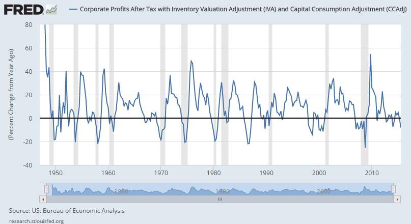
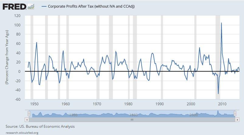
For those readers hoping for a more pure look at corporate profits, the charts that follow should suffice. Whether you prefer to look at corporate profits after tax with or without inventory valuation and capital consumption adjustments, the picture is one ranging from stagnation to an early recessionary environment.
(click to enlarge)
(click to enlarge)
Moving along, when it comes to commodities, oil (NYSEARCA:USO) grabs many of the headlines.
But oil isn't the only commodity in free fall. The entire commodity complex has been getting crushed for quite some time, a sign that global supply/demand dynamics are quite out of whack.
In addition to oil, natural gas (NYSEARCA:UNG), gasoline (NYSEARCA:UGA), iron ore, steel (NYSEARCA:SLX), copper (NYSEARCA:JJC), soybeans (NYSEARCA:SOYB), wheat (NYSEARCA:WEAT), corn (NYSEARCA:CORN), aluminum (NYSEARCA:JJU), zinc, nickel (NYSEARCA:JJN), gold (NYSEARCA:GLD), silver (NYSEARCA:SLV), sugar (NYSEARCA:SGG) cotton (NYSEARCA:BAL), lean hogs (NYSEARCA:COW), feeder cattle, and lumber (NYSEARCA:CUT) have all gotten crushed in recent years. A chart of the Bloomberg Commodity Index (below) nicely illustrates the carnage in commodities.
(click to enlarge)

The U.S. economy cannot escape and is not escaping the, dare I say, depression that has befallen the world of commodities. Plunging commodity prices are negatively affecting American companies, American jobs, American families, and U.S. state budgets.
Given falling earnings and plunging commodities, it shouldn't surprise anyone to see consumer prices flirting with deflation and producer prices recently crossing into deflationary territory. It's almost comical that the "data dependent" Fed is so serious about raising rates later this month given the outright deterioration in the economic picture.
(click to enlarge)
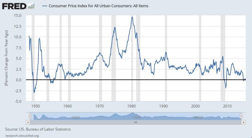
As you will notice in the CPI chart above, the year-over-year change in consumer prices is at levels only rarely reached in the post-WWII era. As eager as I am to see interest rates rise, it's worth mentioning that a truly "data dependent" Fed wouldn't raise rates at this time. If, however, the Fed decides to throw caution to the wind, it will be the first time since the spring of 1987 that the Fed has hiked rates while S&P 500 earnings are falling (source).
In terms of producer prices, as the charts below illustrate, it's not just the manufacturing sector experiencing declining prices. Retail trade industries recently followed suit.
(click to enlarge)
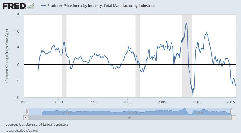
(click to enlarge)

The fact that retail trade is now experiencing year-over-year price declines only further adds to the recessionary-like environment now gripping the U.S.
In addition to CPI and PPI, import and export prices also fail to inspire an economic-growth narrative. Not surprisingly, given the complete obliteration of commodity prices, the charts below clearly illustrate, whether one includes or excludes petroleum, that prices are falling fast.
(click to enlarge)
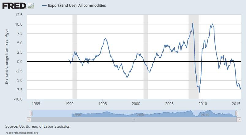
(click to enlarge)
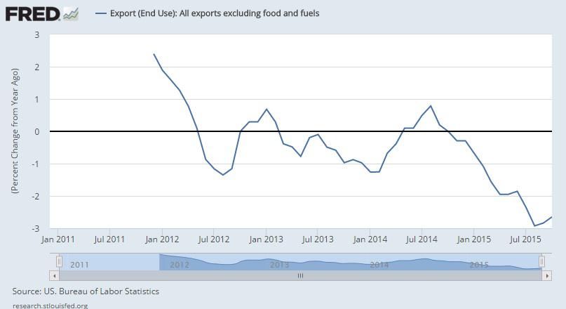
(click to enlarge)
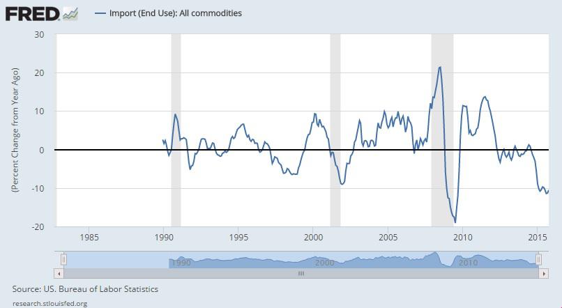
(click to enlarge)

If you're still not convinced U.S. economy is slowing, there are several more charts that scream recession.
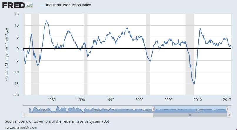
First, industrial production. As the chart that follows shows, industrial production is on the verge of year-over-year declines, levels typical of a recession. Moreover, capacity utilization is currently at 77.5%, below the 1972 to 2014 average of 80.1%.
(click to enlarge)
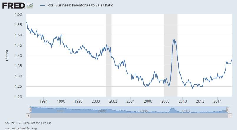
Next up, inventory-to-sales. There is no doubt that the pace of the rise of the inventories-to-sales ratio is screaming "recession ahead."
(click to enlarge)
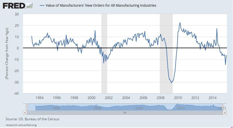
Turning to manufacturing, the value of new orders for all manufacturing industries is now in steep decline, matching levels indicative of a recession (see chart below).
(click to enlarge)
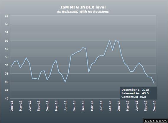
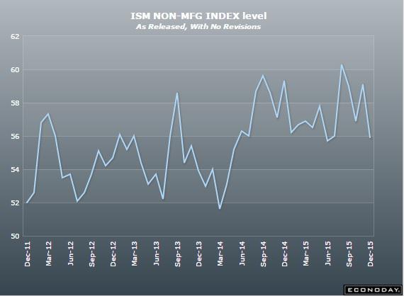
Furthermore, the November 2015 Manufacturing ISM Report On Business showed the manufacturing sector is now contracting, falling below the all-important 50 level to the lowest level since June 2009.
While it is true that the ISM non-manufacturing report is still at a solid 55.9, its recent massive miss to expectations, coupled with its recently touching the lowest level since May should leave some wondering whether the troubles in manufacturing are now spreading elsewhere.
Thus far, I've covered corporate profits, commodities, CPI, PPI, export and import prices, industrial production, inventories-to-sales, and manufacturing, all of which collectively point to a recessionary environment. I have four more charts that, while on their own, do not necessarily signal a recession, when viewed in light of everything else I've presented, add to the narrative of the U.S. economy being in a slowdown one could characterize as a recession.
Those who followed my commentaries over the years know I have a special place in my heart for income-producing assets. This includes bonds. Below you will find a chart of high-yield bond spreads. Typically, rising spreads in the world of junk bonds are a canary in the coal mine for the broader economy. As the chart below clearly shows, high yield spreads began moving notably higher prior to each of the two previous recessions. I suspect this time will not be different.
(click to enlarge)
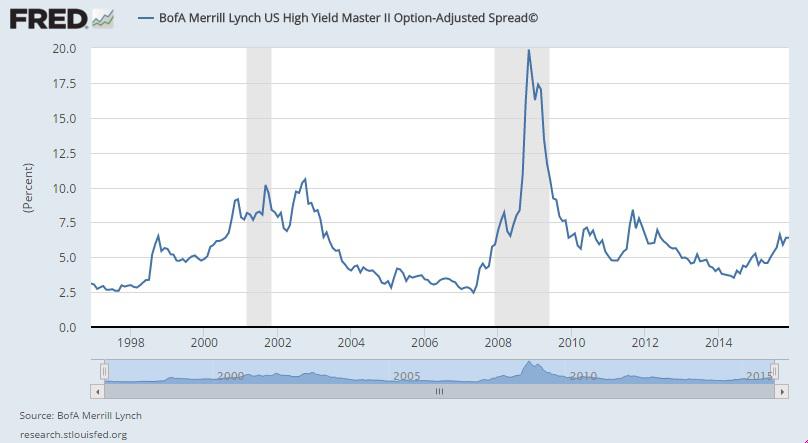
Even though spreads are not yet at levels indicative of a recession, spreads have moved notably higher since the summer of 2014. As someone who is active in the bond market, I can tell you first-hand that it's not just commodity-related companies experiencing spread widening. There is, to varying degrees, across-the-board spread widening occurring. Those on recession-watch should pay close attention to future movements in this part of the bond market.
The second of the final four charts is average hourly earnings of production and non-supervisory employees. As you will notice, each of the past seven recessions have begun with average hourly earnings growing at faster rates than today. In other words, from a historical perspective, the current tepid growth in wages is already recession-like.
(click to enlarge)
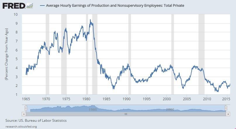
Given the pace of technological advancements, a plunging labor force participation rate, and the widespread emphasis on cost-cutting permeating C-Suites across the country, there is little reason to believe the wage picture, as a whole, will improve dramatically in the coming months.
The penultimate chart is a recent favorite of mine. My article "A Brand New Way To Track The Labor Market," discusses its construction in detail. But for the purpose of this article, let me simply say that the Labor Market Conditions Index (chart below) is a useful indicator for predicting recessions. While it doesn't necessarily mean there will be a recession if the LMCI drops below zero, it is worth noting that each of the last five recessions, dating back to the beginning of the data set, were preceded by the LMCI dropping below zero.
(click to enlarge)
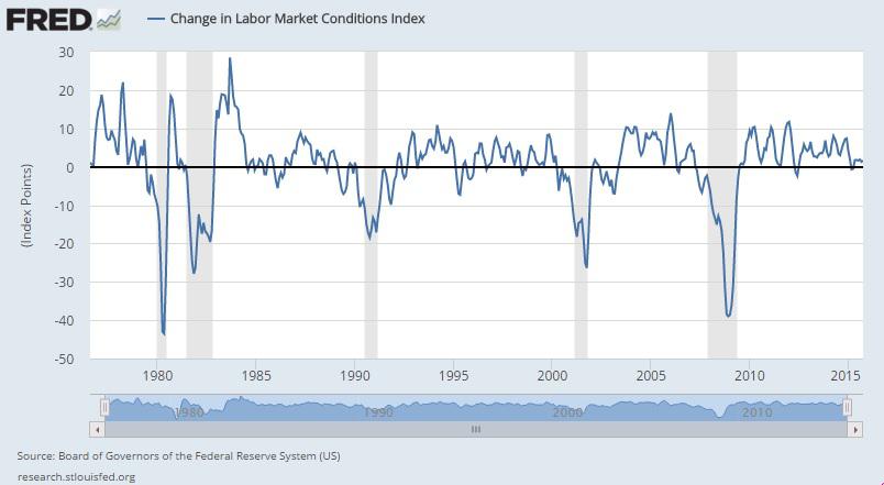
Currently, the index sits at 1.6, with an update due early next week. Even though economic optimists will point to low levels of jobless claims and the low unemployment rate as indicative of a healthy labor market, this index, which dives much deeper into the analysis of the labor market, is painting a different picture. Given the LMCI is down notably from year-ago levels and sitting just above zero, it deserves extra attention moving forward.
As an aside related to the labor market, it's also worth noting that with one month to go in 2015, the Challenger, Gray & Christmas layoff report is on pace to finish the year with the highest number of layoff announcements since 2009.
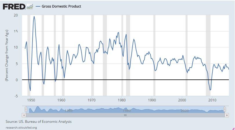
Last but certainly not least are two charts that many may be surprised to see included in this commentary. The first chart that follows shows nominal GDP (not adjusted for inflation) in the post-WWII era. As you will notice, there has been a clearly defined slowing of U.S. economic growth since the late 1970s, with lower highs and lower lows in nominal GDP. In fact, nominal GDP growth as slow as it is today has been associated with recessions dating back to the early 1970s.
(click to enlarge)
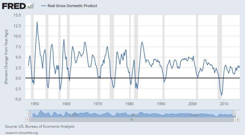
On a "real" GDP basis (adjusted for inflation), the picture is slightly better. With that said, one can clearly see just how bad the post-financial-crisis recovery has been.
(click to enlarge)
Investment Implications
What are the investment implications of the recession-like economic picture outlined above? As the following December 3, 2015 Yahoo Finance headline would have some believe, bad news is "Good news!"
(click to enlarge)

I, however, like to be a lot more prudent in my investing decisions than simply hoping that things have gotten so bad they can only get better from here. In the following paragraphs, I would like to touch on the various asset classes in which I am invested and share insights about how one might navigate the tricky investing environment in which we currently live.
Private Equity
In recent months, there has been no shortage of discussions concerning unicorns (startups/private companies valued at $1 billion or more) and the rich valuations that have spread across the private equity space. I have reviewed dozens of opportunities in the private equity space this year, adding just two new investments. As the year has progressed, I've noticed both deal terms and valuations reaching levels indicative of too much liquidity chasing too few opportunities. Put differently, there are definitely bubble-like characteristics in the private-equity space.
As such, my threshold for making new investments has gone up dramatically. In the world of private equity (an illiquid asset class), when the tide goes out, it goes out fast and funding dries up quickly.
My investing philosophy has now shifted from a focus on finding new opportunities to a focus on financially supporting my "winners." When evidence of a slowing economy begins to mount, it's important for startup CEOs to have the foresight to build up their cash coffers, thereby allowing them sufficient cushion to continue their growth path during challenging economic times.
Treasuries
I am of the opinion that every well-diversified portfolio should include some exposure to U.S. Treasuries (NYSEARCA:TLT). The exact percentage and maturities will depend on your individual circumstances.
The extremely liquid nature of and historical price behavior of Treasuries during challenging economic times are such that they not only help smooth out returns but also prevent investors needing liquidity from having to sell illiquid assets at unfavorable prices.
Corporate Bonds
Earlier this year, I reduced risk in my portfolio's individual bond allocation, with much attention focused on the non-investment grade portion of my allocation. Even though large swaths of the junk bond market have gotten crushed as the year progressed (some might be tempted to buy the dip), I am still being extremely selective in putting new money to work.
There are select opportunities in the double-B space and select opportunities in the investment grade space. But the threat of a reversal in the Fed's ultra-easy monetary policy combined with rising corporate spreads means investors should shy away from bond funds and remain focused on higher-quality (a relative term) single-bond selection.
A few weeks ago, I highlighted one such opportunity in Molson Coors (NYSE:TAP), when it's long-dated bond was yielding 5.895%. The bond has since rallied from 87.57 to 99.717, sending the yield plummeting to 5.019%. It's a good example of how regardless of what Treasuries are doing, one can find opportunities in corporate bonds.
There are currently other such opportunities among non-commodity-related bonds and perhaps I will highlight a few in the future. For the time being, however, let me end this brief discussion of corporate bonds with the following insight:
I view today's carnage in commodity-related corporate bonds as a far worse opportunity then that during the Great Recession. It is for that reason that I dramatically reduced risk in my corporate bond allocation earlier this year. The problem is this: when a downturn such as that in commodities lasts for as long as it has (measured in years rather than months), companies that get priced out of the bond market (meaning yields on their bonds are so high they can't refinance debt) will have to issue secured debt (thereby subordinating unsecured debt), draw down lines of credit, or default. In 2008/09, the plunge and recovery happened so fast that many companies were able to ride out the declines. This time is notably different. It's the long, drawn-out nature of the current decline, with no end in sight, that makes the situation so precarious for so many commodity-related companies.
Preferred Stocks
The year to buy preferred stocks (NYSEARCA:PFF) was 2013. In my opinion, they are definitely not a "buy" in today's environment. I took profits in some of my preferreds earlier this year and the rest I could part with at any time.
In case you're not familiar with the world of preferred stocks, they sit above common stock and below bonds on the capital structure. Should you search for preferreds to add to your portfolio, you'll likely come across the preferreds of many banks, REITs, and utilities. They dominate the asset class. Given the highly cyclical nature of banks and REITs, and the high debt burdens of utilities, recessions can be quite bad for those types of companies, and, consequently, their preferreds. Add to that the low-coupon preferreds issued during the past several years (thanks, Fed!) as well as the high durations associated with preferreds, and you have a security better purchased earlier in an economic cycle or after a large run-up in benchmark Treasury yields (like in 2013). Neither of those two environments describes today.
Precious Metals
Similar to Treasuries, I am of the opinion that every properly-diversified portfolio should have exposure to the one store of value that has stood the test of time: gold . Fiat-money systems have a history of failing. I have no idea whether today's system will outlive me. Rather than guessing or hoping, I simply hedge my assets by owning a store of value that has a history of being convertible into whatever fiat currency comes along.
Gold, in dollar terms, is trading at multi-year lows. If you've been holding off hedging your assets with history's ultimate store of value, now seems like a good time to purchase half an allocation. Given the upcoming highly-anticipated Fed meeting later this month, it is likely gold will move strongly up or down after the Fed's announcement. You could roll the dice and wait, or buy half now and the other half after the announcement. If I were on the verge of initiating an allocation to gold, I'd favor buying half now and half later.
Commercial Real Estate
At this point in the cycle, I wouldn't touch the common stock of REITs (NYSEARCA:IYR) with a 10-foot pole. I do have a notable position in various physical apartment complexes (across numerous partnerships) and will continue to allocate money in that direction throughout the economic cycle.
If you have access to private deals, don't forget the importance of staying focused on terms of seven years or more (the longer the better) with high occupancy rates in good locations (rising populations, no excessive supply coming to market, etc.), no more than 75% to 80% loan-to-value, and minimal upcoming maintenance requirements. Patience is key when searching for solid long-term investments in commercial real estate. The influx of foreign money and new investors (driven to real estate by geopolitical risks abroad and the Fed's excessively-easy monetary policy) has pushed cap rates to ridiculously low levels throughout the country (but especially on the coasts). If you invest in this environment, you need to make sure your holding period (and mortgage term) is long enough to wait out a rise in cap rates.
On a final note, at this point in the economic cycle, I wouldn't be putting new money to work in any ground-up opportunities or in non-multi-family physical real estate, such as in industrial, retail, or office.
Public Stocks
I saved everyone's favorite for last. What about public stocks? Back in May, I sold all my individual stocks (representing the overwhelming majority of my equity allocation) and held on to my index funds. While I did add to my index fund allocation during the August sell-off, I think stocks are so overvalued at current levels that I could only imagine desperate investors or special situations being the impetus for an equity purchase today.
At the time of this writing, the S&P 500 is trading just shy of 20 on a trailing 12-month P/E basis, and forward earnings estimates have proved to be so incredibly unreliable in recent months so as to render them completely useless. With that in mind, I think it's reasonably safe to say that an allocation split equally between quality corporate bonds held to maturity and physical multi-family real estate (as outlined above . . . staying away from the coasts) will not just beat but crush the performance of the S&P 500 in the years to come.
In addition to the insanely valued broad-market indices, it's worth noting the mockery of serious fundamental analysis the Fed has created by allowing interest rates to remain so low for so long. The "bad news is good news" mantra that permeates the world of index investing has grown so loud in recent weeks that it should be borderline offensive to anyone who takes seriously the idea that rising stock prices are somehow related to a strong economy. They aren't.
Instead, rising stock prices are related to easy-money. Money printing has a history of leading to higher asset prices. The only question now is how bad the hangover will be when the high wears off.
Conclusión
There can be little doubt the U.S. economy is in the midst of a notable slowdown. In fact, as I have outlined throughout this commentary, the U.S. economy appears to be staring a recession in the face.
Investment implications will vary based on how policymakers respond to the situation at hand.
Regardless of what they do, however, there currently are and will continue to be investment opportunities across various asset classes. I hope my insights that followed the economic commentary will be helpful, as you decide how best to allocate your funds in the coming weeks and months.
Good luck and all the best in 2016!
0 comments:
Publicar un comentario